import numpy as np
import matplotlib.pyplot as pltExploring probability distributions

What happens when we add two sets of data with rectangular probability distributions?
n_samples = 100000
hist_bins = 200
data_1 = np.random.rand(n_samples)
plt.hist(data_1, bins=hist_bins)
plt.show()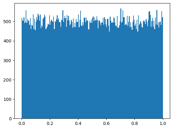
data_2 = np.random.rand(n_samples)
data_2 = data_1 + data_2
plt.hist(data_2, bins=hist_bins)
plt.show()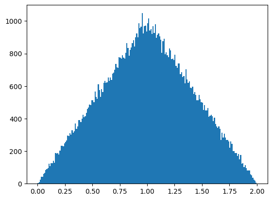
We can see here that the two rectangular probability distributions combine into a new set of data with a triangular distribution.
This can be understood by considering rolls of two siz-sided dice. If you’ve played catan or other two dice games, you’ll know that the probability of rolling a 7 is higher than any other number. 2 and 12 are the least likely numbers. This is because there are multiple ways to roll a 7 (1&6, 2&5, 3&4), and only one way to roll a 2 (1&1) or a 12 (6&6)
Starting with the sum of the lowest number on each dice, the number of combinations of dice rolls which make the next possible sum increases. The probability of rolling the next possible number increases with a linear relationship as the number of ways of rolling this number increases. This holds true up to the middle sum, then decreases linearly.
Both the dice on their own have a rectangular probability distribution, but together their probability distribution is triangular.
Adding a third rectangular set of data
data_3 = np.random.rand(n_samples)
data_3 = data_3 + data_2
plt.hist(data_3, bins=hist_bins)
plt.show()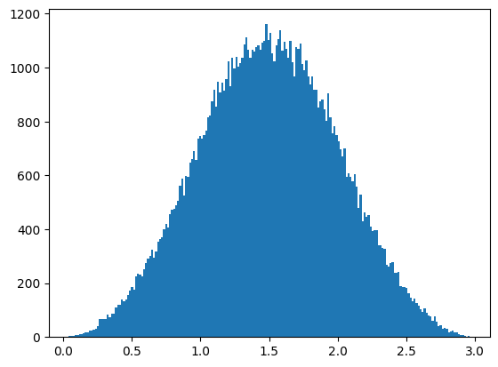
Now we see a bell curve.
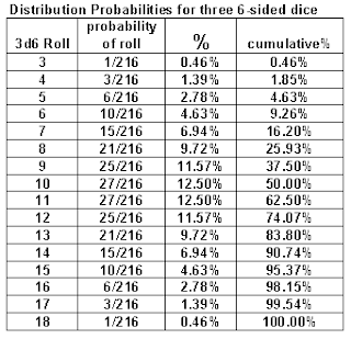
The shape of this curve can be understood by looking at a table of the odds of each roll combination of three six-sided dice:
Adding a fourth rectangular distribution changes the shape and the spread of the bell curve.
data_4 = np.random.rand(n_samples)
data_4 = data_4 + data_3
plt.hist(data_4, bins=hist_bins)
plt.show()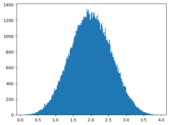
Normalizing the data lets us see the way the spread of probabilities changes as we add more rectangular distributions together.
def normalize(data):
    return data / data.max()
plt.hist(normalize(data_2), bins=hist_bins)
plt.subplot()
plt.hist(normalize(data_3), bins=hist_bins)
plt.subplot()
plt.hist(normalize(data_4), bins=hist_bins)
plt.subplot()
plt.legend(['n=2', 'n=3', 'n=4'])
plt.title('Effect of summing multiple rectangular probability distributions.\n Data is normalized to allow overlapping bell curves.')
plt.show()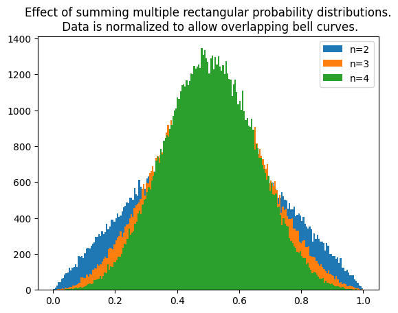
Conclusion
We can see here that adding together data sets with rectangular probability disributions creates a triangular distribution for the first addition where n = 2, and creates data with increasingly tighter bell curve shaped probability distributions for increasing n > 2.